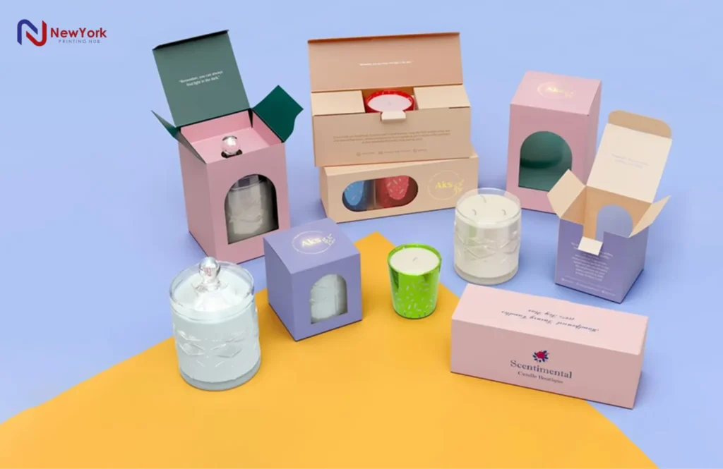
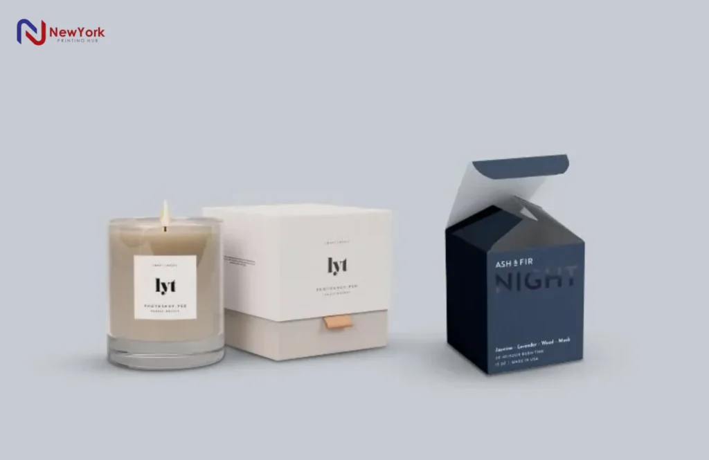
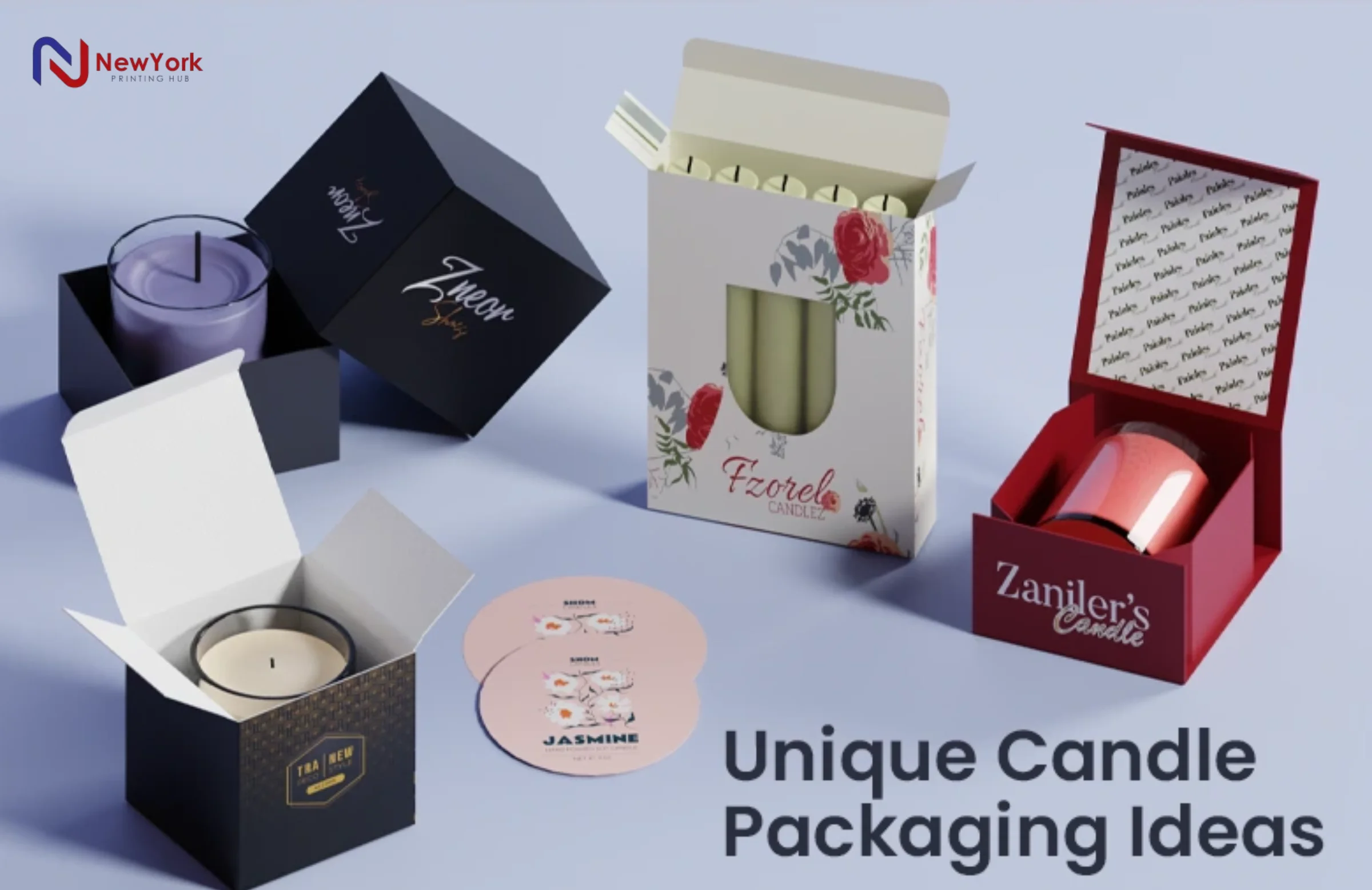
The packaging of candles plays a vital role in branding, marketing, and customer experience. A well-designed candle box not only protects the product but also creates a psychological and physical connection with buyers. In today’s competitive market, candle packaging USA is more than just a protective cover it’s a marketing tool that can attract, engage, and convince customers to choose your brand.
At New York Printing Hub, we specialize in custom candle packaging that blends functionality with visual appeal. Whether you’re a small business or an established candle brand, our tailored designs ensure your product stands out on shelves and online.
Tricks to Attain the Perfect Candle Packaging Design
1) Start with Visualization
What it means: Turn ideas into concrete visuals before spending on production.
How to do it well:
- Moodboard: Gather references for color, typography, finishes (foil, emboss, spot UV), and textures that match your fragrance families (e.g., earthy for sandalwood).
- Dieline creation: Define your box structure (sleeve, tuck-end, rigid, or mailer). Start with vessel dimensions (diameter/height) and add 2–4 mm clearance for tissue, dust caps, or inserts.
- 3D mockups: Create digital renders to see how artwork wraps around panels, where seams land, and how logos align.
- Paper dummy (white sample): Ask for an unprinted prototype to test fit, closure strength, and insert snugness.
- Competitive scan: Line up 6–10 competitor boxes. Note panel hierarchy (brand > scent > notes), finishes used, and how they communicate burn time and safety. Repeat what works; improve what doesn’t.
NYPH advantage: We’ll provide dielines, 3D proofs, and white dummies before you commit reducing reprints and material waste.
2) Keep the Design Simple
Why “less is more” works: Clarity converts. Minimal layouts increase shelf readability and make your premium details (foil logo, soft-touch) feel intentional.
Practical rules:
- Visual hierarchy: 1 hero element (logo/scent), 1 secondary (fragrance notes), 1 tertiary (size/burn time).
- Whitespace: Maintain at least 8–12 mm margins around key text.
- Panel planning: Front = brand/scent; Side = notes + burn time; Back/Bottom = ingredients, warnings, barcode, batch.
- Cost check: Simple ink coverage and fewer embellishments reduce unit cost especially at low MOQs.
NYPH tip: We’ll show you “lite vs. luxe” artwork versions so you can compare cost impact of each finish.
3) Focus on Branding and Positioning
Translate brand story into packaging:
- Luxury: Rigid boxes (1200–1500 gsm chipboard) + soft-touch lamination + foil + blind emboss.
- Eco/Artisan: Kraft (250–350 gsm), soy inks, uncoated textures, paper or pulp inserts.
- Modern lifestyle: Clean sans-serif type, matte coatings, spot UV for logo pop.
Positioning checklist: Target audience, price point, retail channel (boutique vs. e-com), unboxing sequence, and sustainability claims.
NYPH service: Brand workshops, substrate sampling, and finish swatches to align the look with your market.
4) Identification is Essential (Shelf vs. Online)
In-store (3–6 ft view):
- Logo height ≥ 10–14 mm, scent name ≥ 9–12 pt.
- High-contrast front panel; avoid low-contrast pastel text on pastel backgrounds.
Online (thumbnail view): - Simplify: bold scent name and brand mark visible at 120–180 px wide.
- Avoid tiny scripts; include lifestyle photos and a hero angle that shows structure + finish (e.g., foil glint).
NYPH add-on: We deliver retail photos + e-com mockups sized for marketplaces and your site.
5) Think About Typography
Goals: Legibility, personality, and compliance.
Best practices:
- Type pairing: One display font (headings) + one workhorse sans-serif (details).
- Sizes: Warnings and instructions ≥ 7–8 pt minimum; 9–10 pt preferred.
- Line length: Keep body copy 45–65 characters/line to avoid crowding.
- Contrast: Aim for at least 4.5:1 contrast ratio (dark on light or light on dark).
- Scripts: Use sparingly avoid for ingredients, warnings, or small text.
NYPH tip: We preflight files for minimum sizes and contrast so you pass retailer QC.
6) Select the Right Colors
Color psychology for candles:
- Citrus/Marine: Blues/teals fresh, clean.
- Gourmand (vanilla/caramel): Cream, mocha, warm neutrals comfort.
- Woody/Smoky: Charcoal, forest green depth, sophistication.
- Floral: Blush, lavender soft, romantic.
Technical notes: - CMYK vs. PMS: Use Pantone for brand-critical hues across runs; CMYK for photos/gradients.
- Coatings impact: Matte mutes; gloss deepens; soft-touch can darken colors slightly request drawdowns.
NYPH process: We provide color proofs and Pantone drawdowns under D50 lighting to lock accuracy.
7) Use Contrast Effectively
Why it matters: Contrast directs attention and ensures readability.
Ways to create contrast:
- Value: Light text on dark background (or vice versa).
- Scale: Large scent name vs. small descriptor.
- Texture/Finish: Matte background with spot UV on logo; foil against uncoated kraft.
Quick test: Convert your design to grayscale if hierarchy disappears, increase contrast.
NYPH tool: We run quick legibility checks and propose micro-adjustments before plates are made.
8) Printing Options for Candle Packaging USA (When to Use What)
- Offset / Lithography:
- Best for: Photographic detail, fine typography, tight registration.
- Run size: Medium to large; most common for folding cartons and sleeves.
- Flexo Printing:
- Best for: Corrugated shippers/retail displays; large volumes; good economics.
- Digital Printing:
- Best for: Low MOQs, fast launches, versioning (multiple scents), seasonal drops.
- Note: Excellent for test markets; slightly higher unit cost than offset at scale.
- Pantone (PMS):
- Use for: Brand colors that must match across substrates and reorders.
- Pantone Metallic:
- Use for: Luxe cues without full foil stamping; works great on rigid or heavy SBS.
Finishing menu: Aqueous/UV varnish, soft-touch, lamination, foil (gold/rose/colored), emboss/deboss, spot UV, die-cut windows with PET/PLA film.
NYPH capability: Offset/digital/flexo under one roof + specialty finishing = one-stop quality control.
- Use for: Luxe cues without full foil stamping; works great on rigid or heavy SBS.
9) Focus on Target Audience
Segment tailoring:
- Masculine lines: Deep neutrals, structured type, heavier substrates, magnetic closures.
- Feminine lines: Pastels, soft-touch, foil accents, ribbon pulls.
- Eco-conscious: Uncoated kraft, soy inks, recycled board, minimal ink coverage, plastic-free windows, molded pulp inserts.
Cultural cues: Color meaning varies test palettes with your actual audience.
NYPH support: A/B carton variations and small-batch pilots to validate assumptions before scaling.
10) Convey the Right Message
What to include (clearly, not cluttered):
- Fragrance & notes (e.g., “Cedar • Bergamot • Amber”).
- Burn time & net weight (oz/g).
- Wax & wick type (soy/coconut, cotton/wood).
- Usage & safety (trim wick, burn time per session, keep away from drafts).
- Contact & batch (website, batch/lot for traceability), barcode/QR (to PDP/care page).
Layout tip: Use icons for care instructions to save space; keep warnings in plain, high-contrast text.
Compliance note: In the U.S., general labeling should satisfy FPLA guidelines; many brands follow ASTM candle safety labeling practices. (This is general information not legal advice.)
NYPH safeguard: Compliance-aware templates so you don’t miss critical info.

Why Choose New York Printing Hub for Candle Packaging?
New York Printing Hub is more than a printer we’re your packaging partner.
What you get, step by step:
- Consultation & brief: Define audience, channels, MOQs, budget, timelines.
- Material & finish kit: SBS, kraft, rigid board, coatings, foils mailed swatches to feel and test.
- Engineering & dielines: Exact-fit structures (with inserts) based on your jar/tin/glass specs.
- Artwork preflight: Font licensing, overprint, ink coverage, barcode size, contrast checks.
- Proofing: 3D digital proofs → white dummy → printed color proof (if required).
- Production: Offset/digital/flexo with inline QC; color-managed to Pantone standards.
- Finishing & assembly: Foil, emboss/deboss, windows, inserts, magnet closures.
- Kitting & fulfillment (optional): Pack candles into boxes; label by scent; prepare for FBA/3PL.
- Logistics: USA-wide shipping, split deliveries, and re-order planning.
Why brands stay with us: Consistent color, reliable timelines, transparent costing, and real humans you can call.
Advantages of Custom Candle Packaging
- Brand equity: Cohesive visual system across scents creates recognition and premium perception.
- Protection: Engineered inserts prevent breakage, reduce returns, and protect margins.
- Unboxing & gifting: Thoughtful structures and finishes turn buyers into promoters.
- SKU agility: Versioned artwork makes seasonal drops and collabs easy.
- Sustainability: Recyclable substrates and right-sized packaging lower footprint.
Disadvantages
- Higher upfront cost vs. stock boxes:
Fix: Start with digital runs for validation; scale to offset when volume grows. - Lead times for custom:
Fix: Parallel-track dielines, proofs, and component ordering; book press time early. - Complexity risk (too many finishes):
Fix: Build a modular system base carton + one luxe finish to control cost and reprint time. - Storage & obsolescence:
Fix: Print by forecasted quarter; use universal cartons + scent-specific sleeves/labels.
Check Out Other Articles You Might Be Interested In
- 10 Unique Candle Gift Box Ideas to Delight Your Recipients
- 12 Types of Eco-Friendly Packaging for Food
- Improve your brand’s look with custom lipstick labels
- The Evolution of Luxury Cosmetic Packaging in the USA
- 11 Cute Eyelash Packaging Ideas That Don’t Seem Cheap

FAQs About Candle Packaging USA
1) What box styles work best for candles?
- Folding carton (SBS 300–400 gsm): Cost-effective for single jars/tins.
- Rigid setup box (1200–1500 gsm): Luxury, giftable, strong.
- Mailer/shipper (E-flute corrugate): E-commerce safe; add custom print inside for unboxing.
- Sleeve + tray: Premium feel with efficient material use.
2) What’s the right board weight?
- 8–10 oz jars: SBS 350–400 gsm or rigid 1200 gsm with insert.
- 3-wick/large vessels: Prefer rigid with EVA/pulp insert for top/bottom.
3) Which insert should I choose?
- EVA foam: Maximum protection, luxe feel.
- Molded pulp/card: Eco-friendly, cost-effective.
- Card collars: Light protection, good for retail (not primary shipper).
4) Minimum order quantities (MOQs)?
- Digital: From a few dozen to a few hundred per SKU.
- Offset: Typically 500–1,000+ for economies of scale. (We’ll quote both.)
5) Can you color-match across reorders and substrates?
Yes Pantone libraries + calibrated presses + archived ink formulas ensure consistency.
Final Thoughts
Candle packaging is more than a container it’s a conversion tool. Get the fundamentals right (structure, fit, legibility, contrast), then layer in finishes that align with your positioning. Prototype early, validate with your audience, and scale the designs that sell.
If you want premium, conversion-focused candle packaging tailored for the U.S. market, partner with New York Printing Hub. From engineering your dielines to perfecting color and finishes and even handling kitting and fulfillment we’ll help your candles shine online and in-store.


